Křupeto
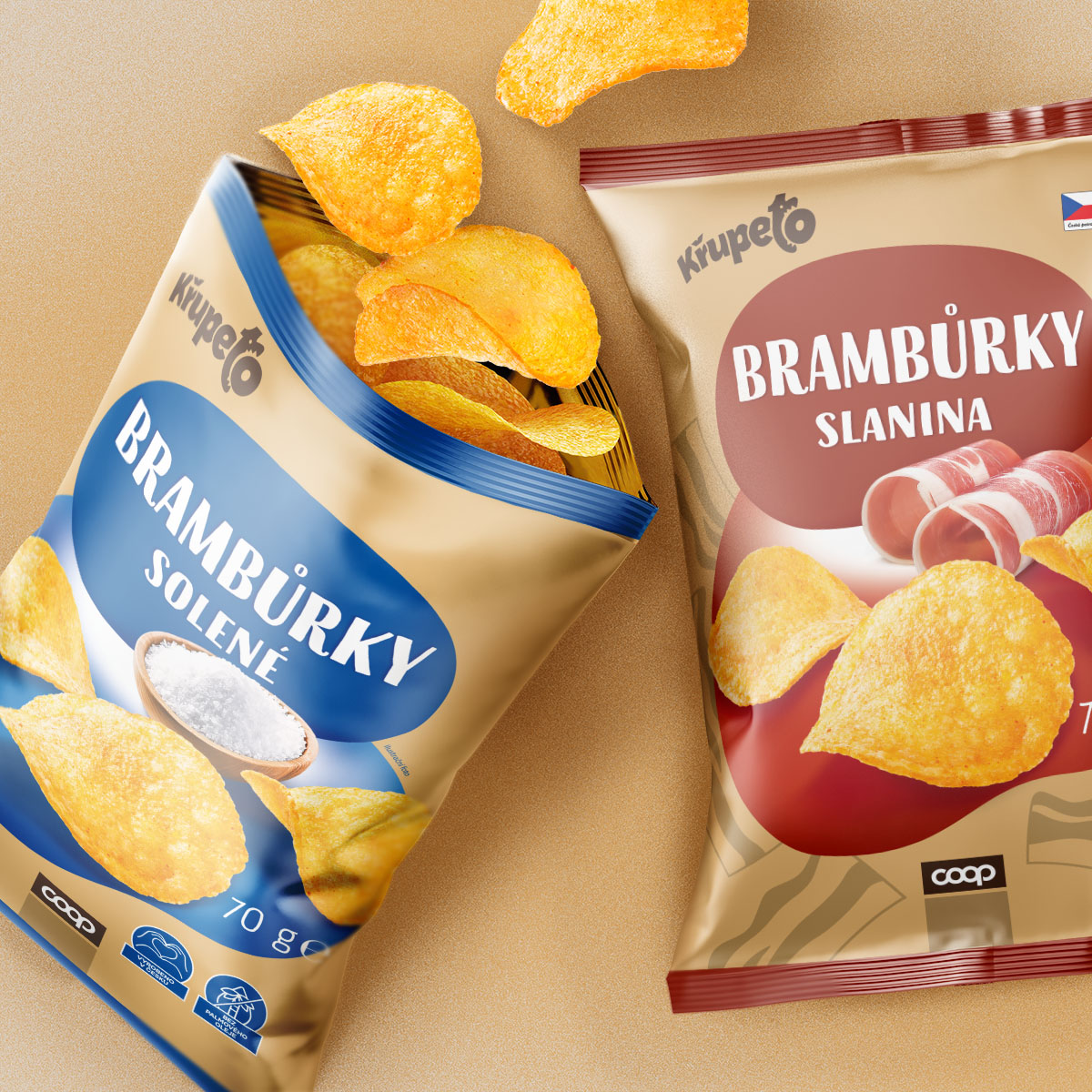
The collaboration with COOP Centrum began with understanding their product vision and brand identity. Křupeto, known for its bold flavors and crispy texture, required packaging that was equally bold and dynamic. Through a series of brainstorming sessions, we identified the need for a design that visually represented each flavor while maintaining a consistent brand identity. For example, the salted chips feature a minimalist salt bowl, while the bacon-flavored chips boast realistic strips of bacon paired with warm, earthy tones.
The design process emphasized versatility, ensuring the visual elements worked across various formats and promotional materials. We carefully combined high-quality photography with stylized illustrations, creating a balance that was both eye-catching and informative. Flavor differentiation was achieved through a thoughtful use of color palettes, typography, and icons, ensuring that each variant was easily recognizable by consumers.
Once the designs were finalized, we tested them with a focus group to confirm their impact and functionality in a competitive retail environment. Feedback indicated that the designs resonated well with both younger and older demographics, thanks to their modern appeal and clarity. The result was a cohesive, engaging packaging series that amplified Křupeto’s brand presence and enhanced the overall shopping experience.
To find out more about our work for Křupeto, get in touch.
Get in touch >
To find out more about our work for Křupeto, get in touch.
Get in touch >