Kapito
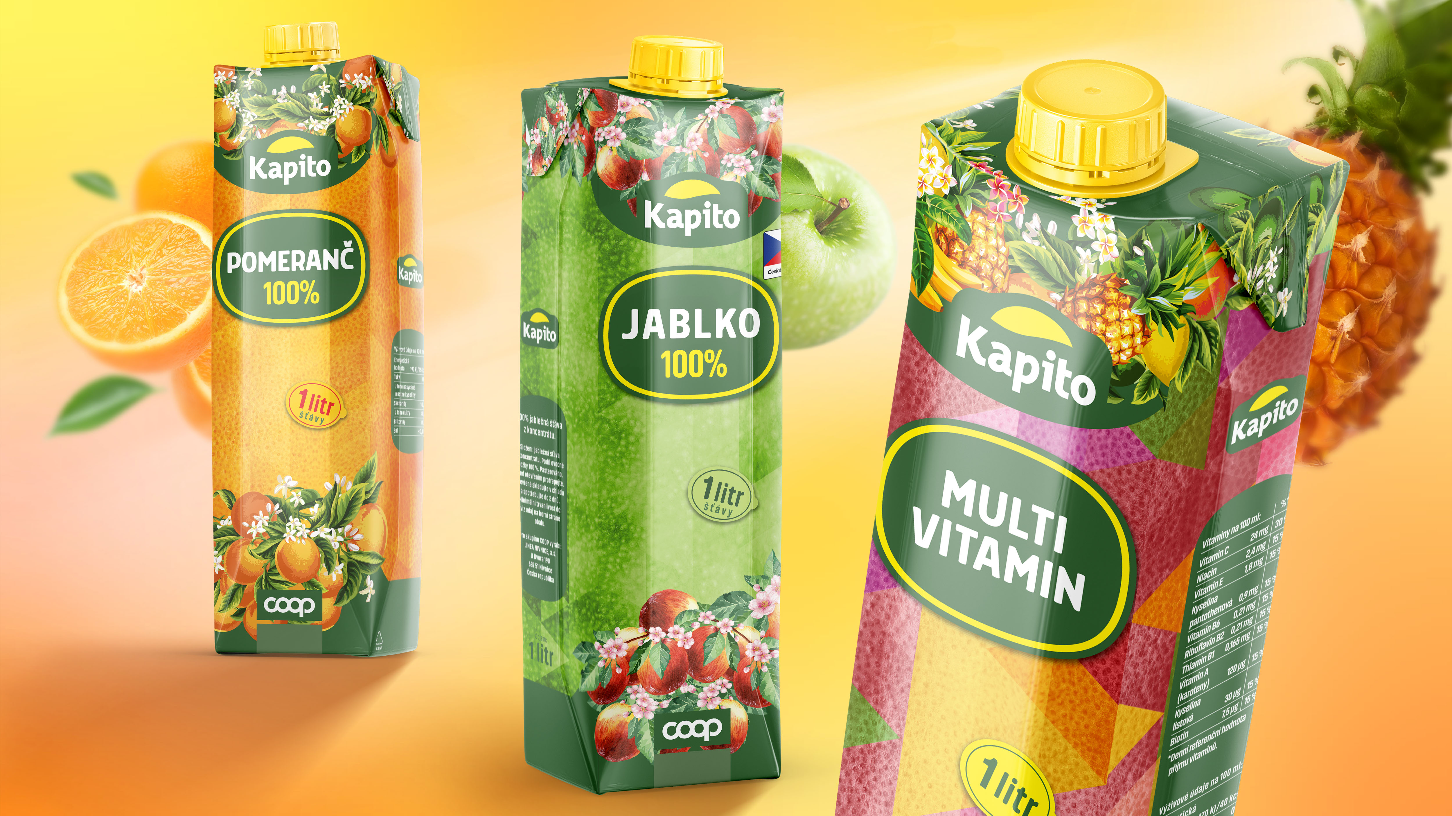
The collaboration began with an analysis of Kapito's target market and their vision for a fun yet premium beverage brand. The priority was to highlight the natural fruit essence of their products while incorporating playful elements to attract younger audiences.
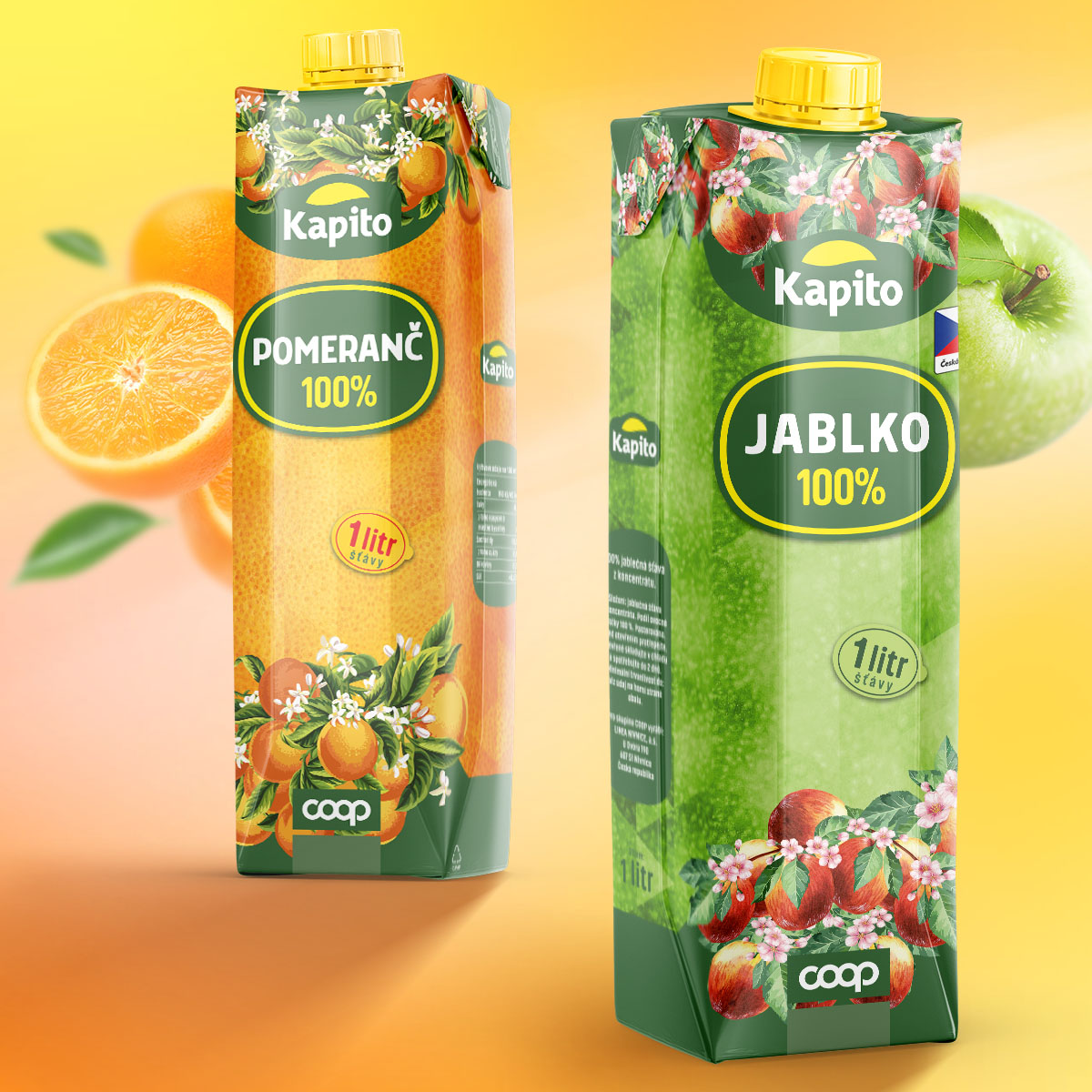
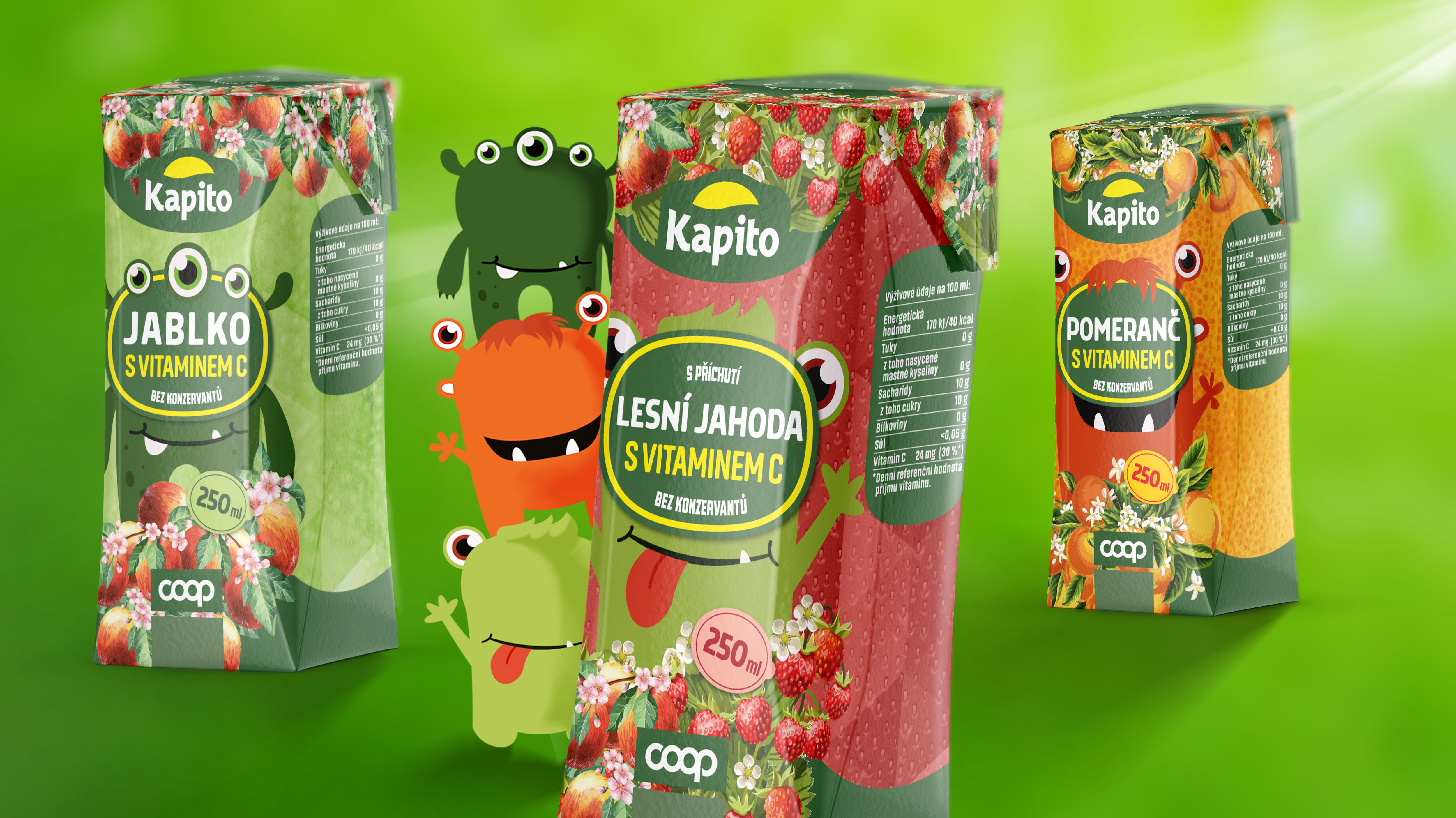
The designs focused on using textured backgrounds inspired by the fruits themselves, enhanced with geometric triangular patterns for a modern touch. Key information like flavor, volume, and benefits was styled to resemble fruit stickers, adding a natural and playful feel. The children's line featured adorable character mascots, seamlessly blending with the product names to ensure an engaging appeal. The Kapito logo, designed to resemble a sunset or fruit slice, added a symbolic and cohesive element to the packaging.
The result was a striking packaging system that successfully differentiated Kapito's beverages. The designs were optimized for shelf visibility, reinforcing brand identity and capturing consumer interest. Retail partners noted increased recognition and engagement, especially with the children's range.
To find out more about our work for Kapito, get in touch.
Get in touch >


To find out more about our work for Kapito, get in touch.
Get in touch >