JOLLIE
Working on this project provided an exciting opportunity for our team, particularly the women on the team, as the JOLLIE brand directly addresses women's needs. The two previous designs were quite different from one another. The first was too outdated and missed the mark for the target demographic, while the second, although more modern and geometric, lacked that soft, feminine touch that was essential to the brand identity.
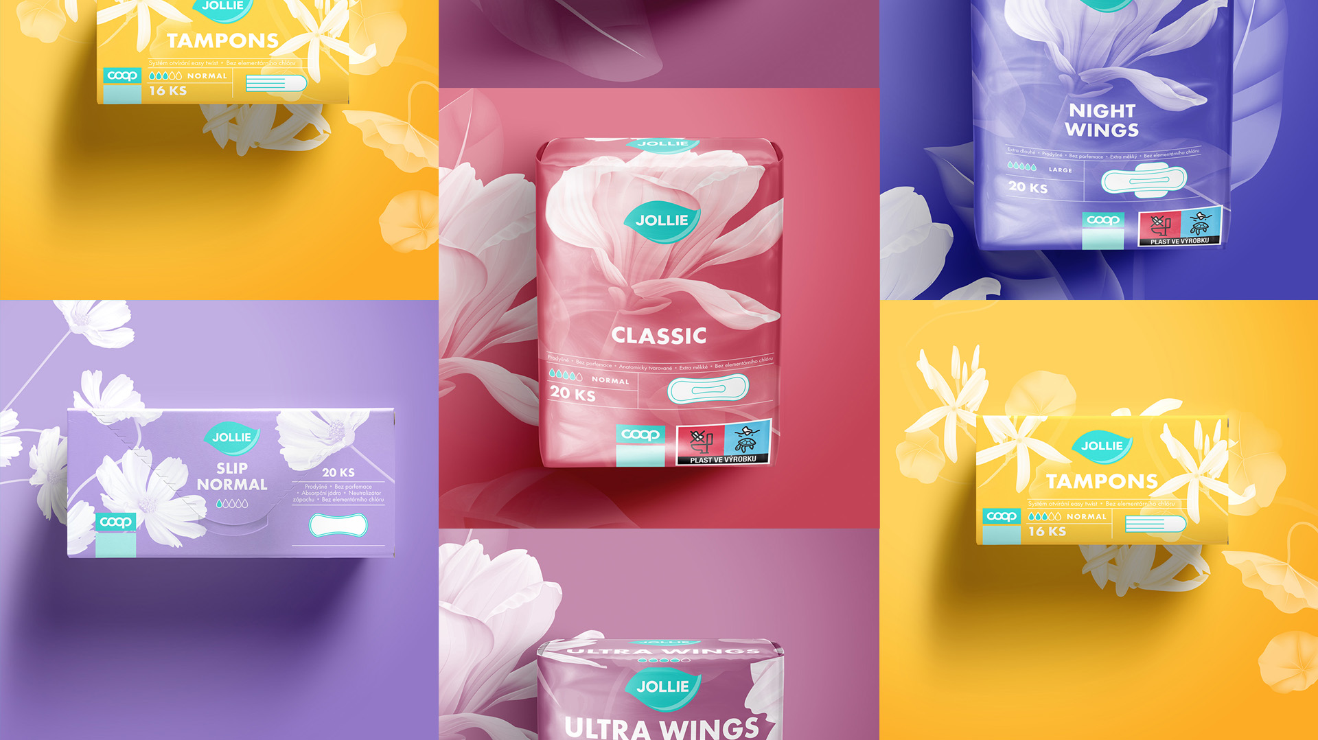
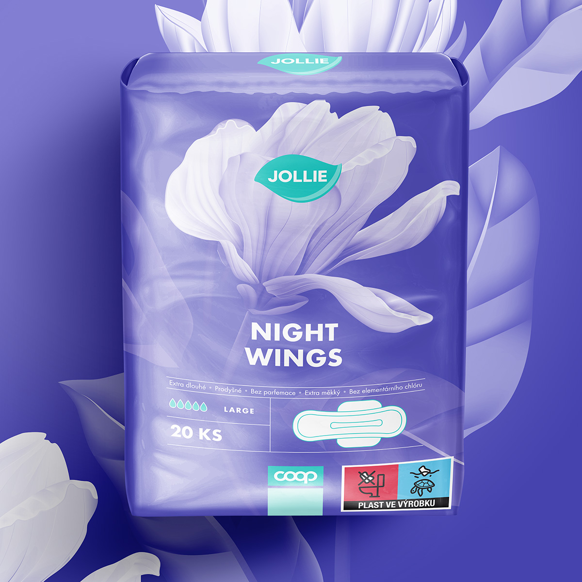
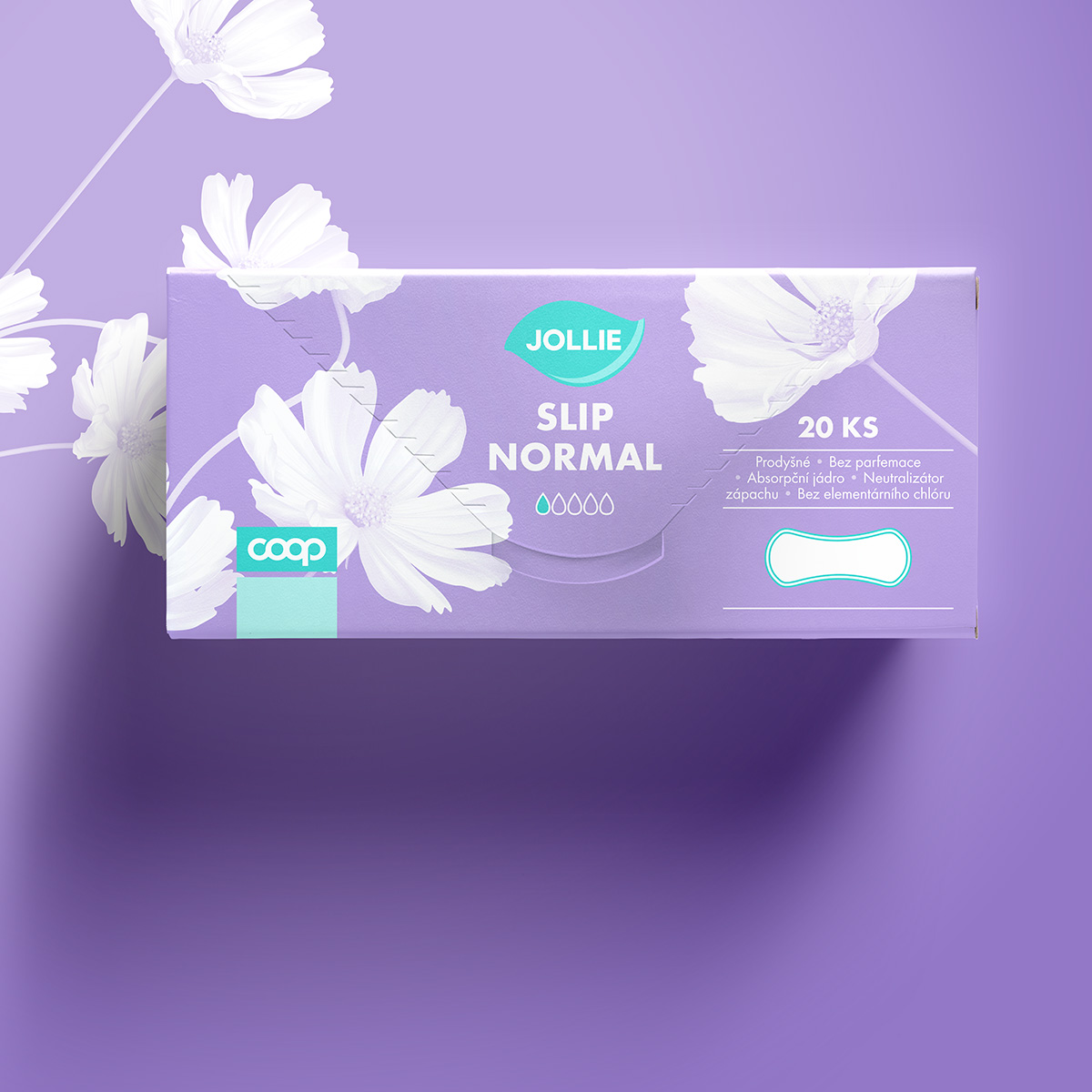
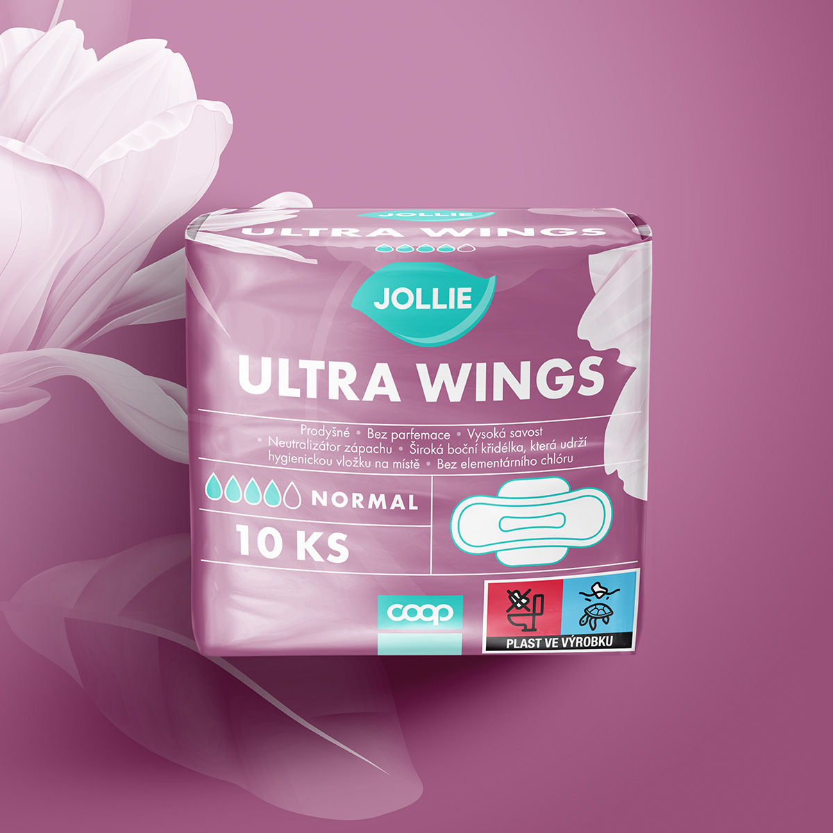
After evaluating these earlier concepts, we began brainstorming how to achieve the perfect balance between modernity and softness. One of our graphic designers took on this challenge, using her expertise to blend softness with simplicity. The result is a design that feels fresh, approachable, and feminine without overwhelming the user with too many details.
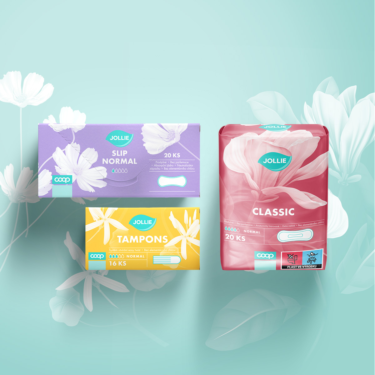
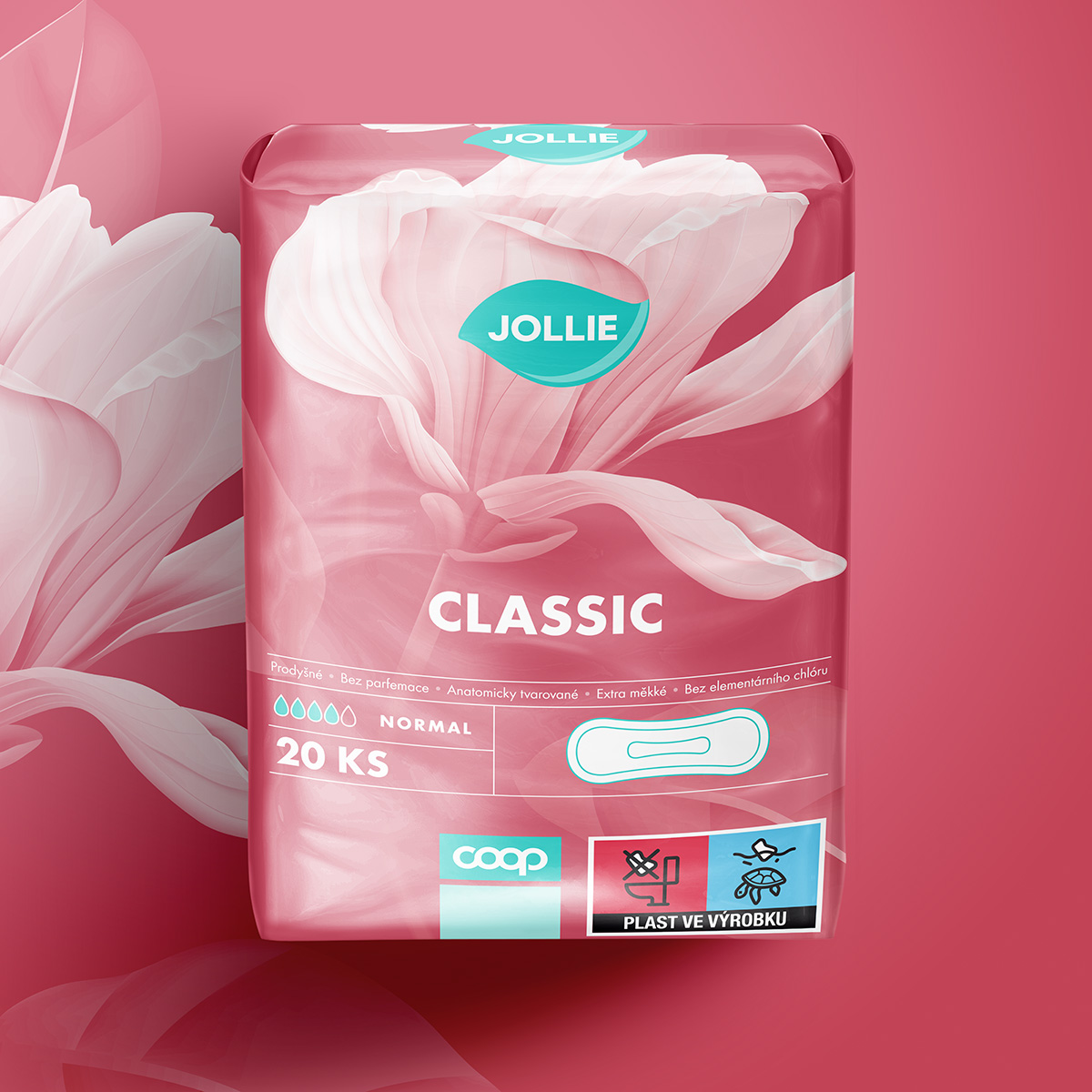
The final JOLLIE packaging design is elegant, light, and communicates just enough without being overly complex. The soft color palette and floral motifs ensure that the product stands out on the shelves, appealing directly to women while aligning with modern packaging trends. We ensured that the design was not only aesthetically pleasing but also functional and practical for daily use.
Ultimately, this project allowed us to enhance the brand’s image while delivering an approachable and appealing packaging design that speaks to the modern woman. Our team was thrilled with the result, and most importantly, so was the client.
To find out more about our work for JOLLIE, get in touch.
Get in touch >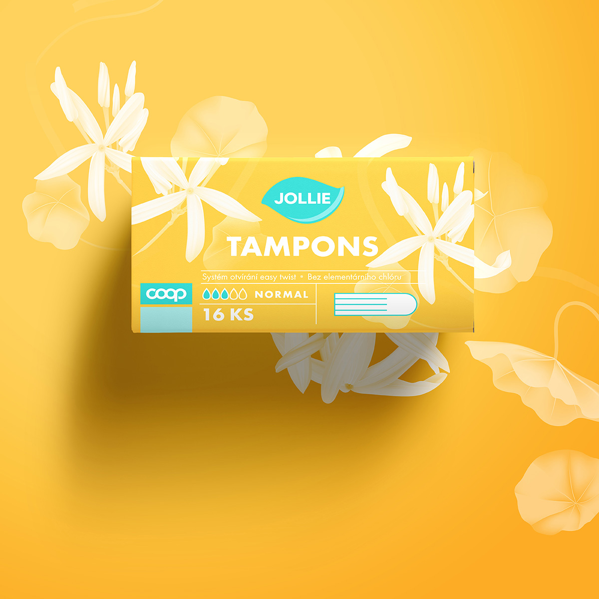
To find out more about our work for JOLLIE, get in touch.
Get in touch >