Dobrá cena
To create the updated design, we worked closely with COOP Jednota Slovakia to fully understand their requirements, target audience, and market strategy. The goal was to balance affordability with a premium look to enhance the perception of their discount product line.
We began by analyzing the existing design, focusing on elements that customers associate with trust and recognition. The color palette, including the prominent deep orange logo, was retained and optimized to enhance visibility while emphasizing the bargain price message. The addition of high-quality photographs complemented the overall design, making it modern yet familiar.
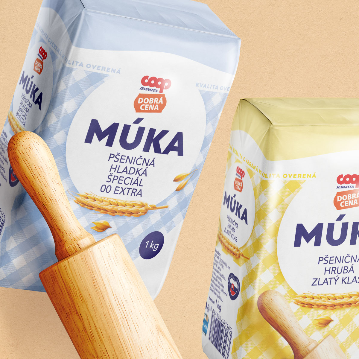
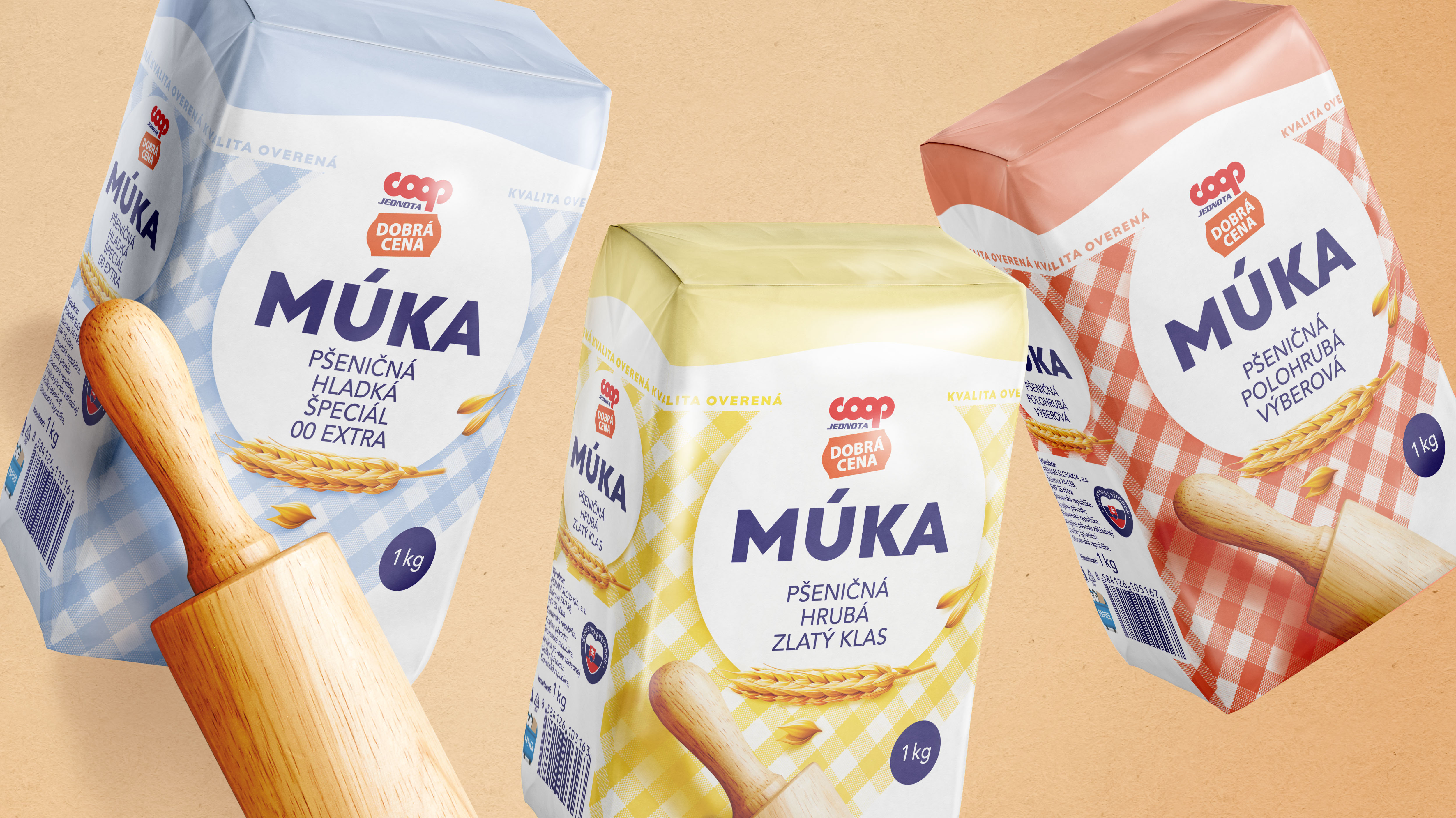
The new design is inspired by simplicity and clarity, incorporating clean typography and vivid patterns for easy differentiation between product types. For example, each flour type—smooth, coarse, and semi-coarse—features a distinct color-coded design, ensuring customers can quickly identify their preferred choice.
Collaboration extended to user testing and feedback from the target audience to confirm the new look's acceptance. This allowed us to fine-tune details like icons, textures, and layouts, ensuring the result aligns with both the brand identity and consumer preferences.
Ultimately, the redesigned packaging achieved the objective of elevating the product’s presentation while respecting its value-driven positioning, setting it apart on crowded store shelves. From now on, shopping carts featuring these products will truly shine.
To find out more about our work for Dobrá cena, get in touch.
Get in touch >

To find out more about our work for Dobrá cena, get in touch.
Get in touch >