Biova
The project began with a brainstorming session where four of our top packaging designers eagerly joined forces to conceptualize the brand's personality. The team focused on understanding the client's vision and the target audience's expectations. This involved researching cosmetic packaging trends, customer preferences, and the brand's core values.
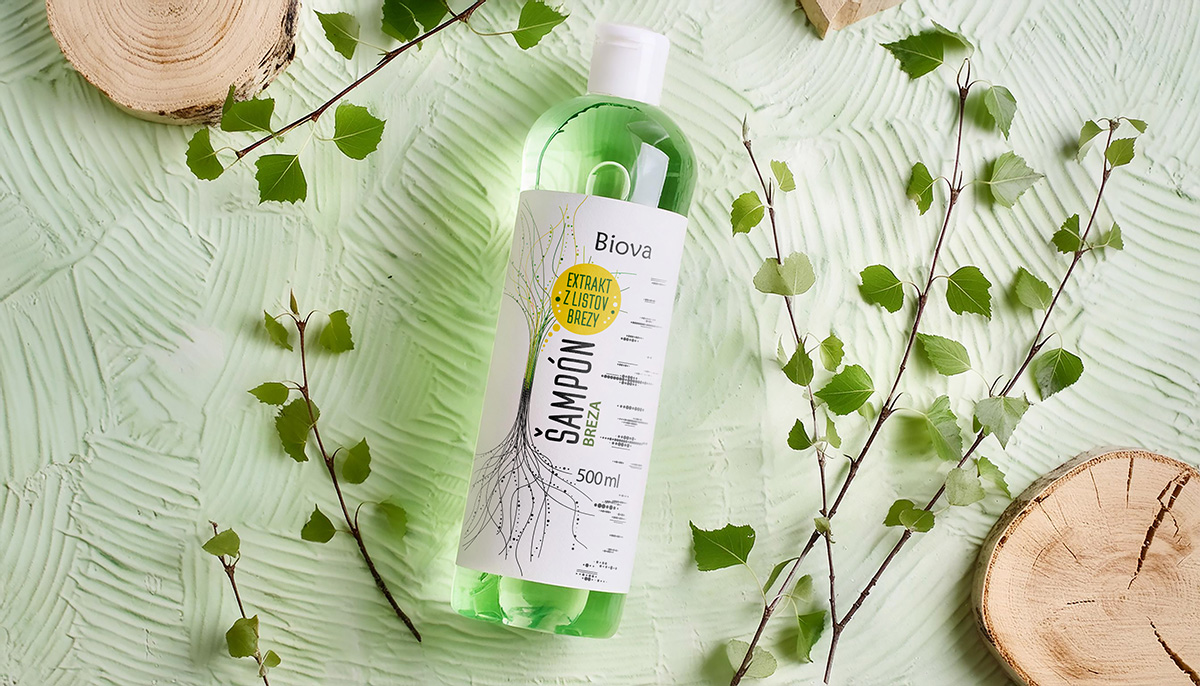
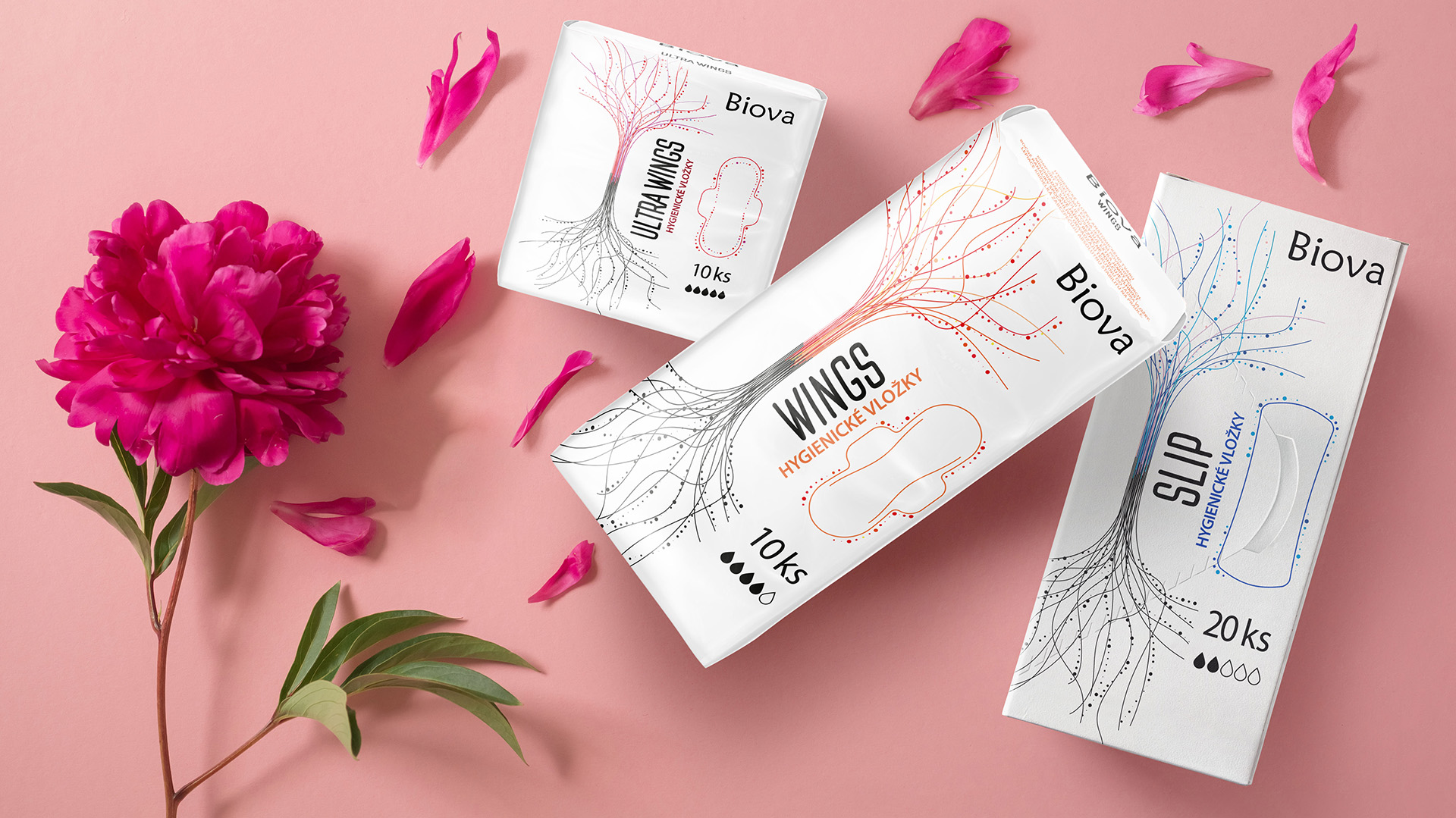
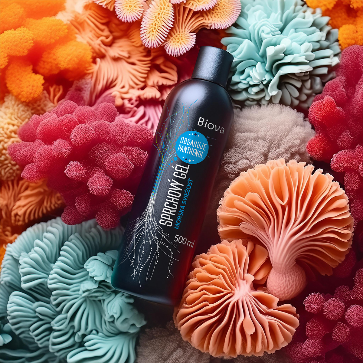
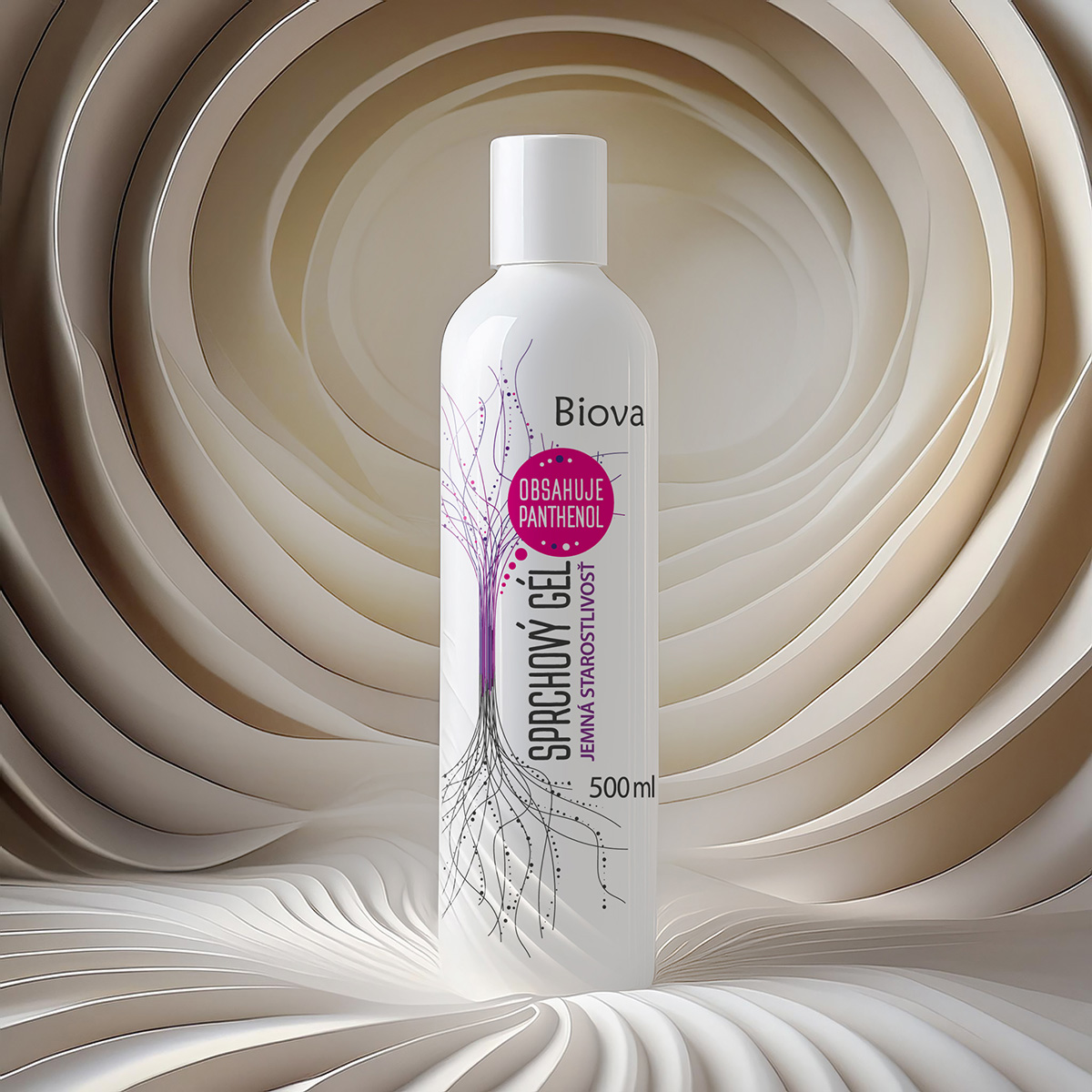
Through collaborative efforts, the brand was named "Biova," evoking a sense of life, nature, and purity. From there, we developed the visual identity, focusing on minimalistic design elements and an organic aesthetic. The bottle shapes were carefully selected to ensure usability while reflecting a sleek and modern style. The graphics emphasized natural motifs like roots, branches, and networks, allowing for versatile interpretation by the user.
Colors were intentionally kept minimal to maintain a clean and sophisticated look, with only subtle highlights to differentiate product lines. Typography and labels were designed for clarity and elegance, ensuring the brand appeals to eco-conscious and health-focused consumers.
The outcome was a comprehensive brand package that included a cohesive logo, typography, packaging design, and detailed guidelines for future product expansions. By maintaining a "less is more" philosophy, the team successfully captured the essence of the brand, blending nature-inspired designs with modern simplicity.
To find out more about our work for Biova, get in touch.
Get in touch >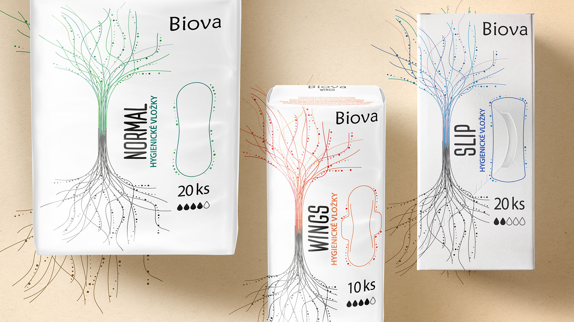
To find out more about our work for Biova, get in touch.
Get in touch >